
THE PROBLEM
Live Room registered its members on paper. The new system had two audiences: visitors who had never seen it, and a team who would use it every day.
MY CHOICES
Six decisions shaped the screens.
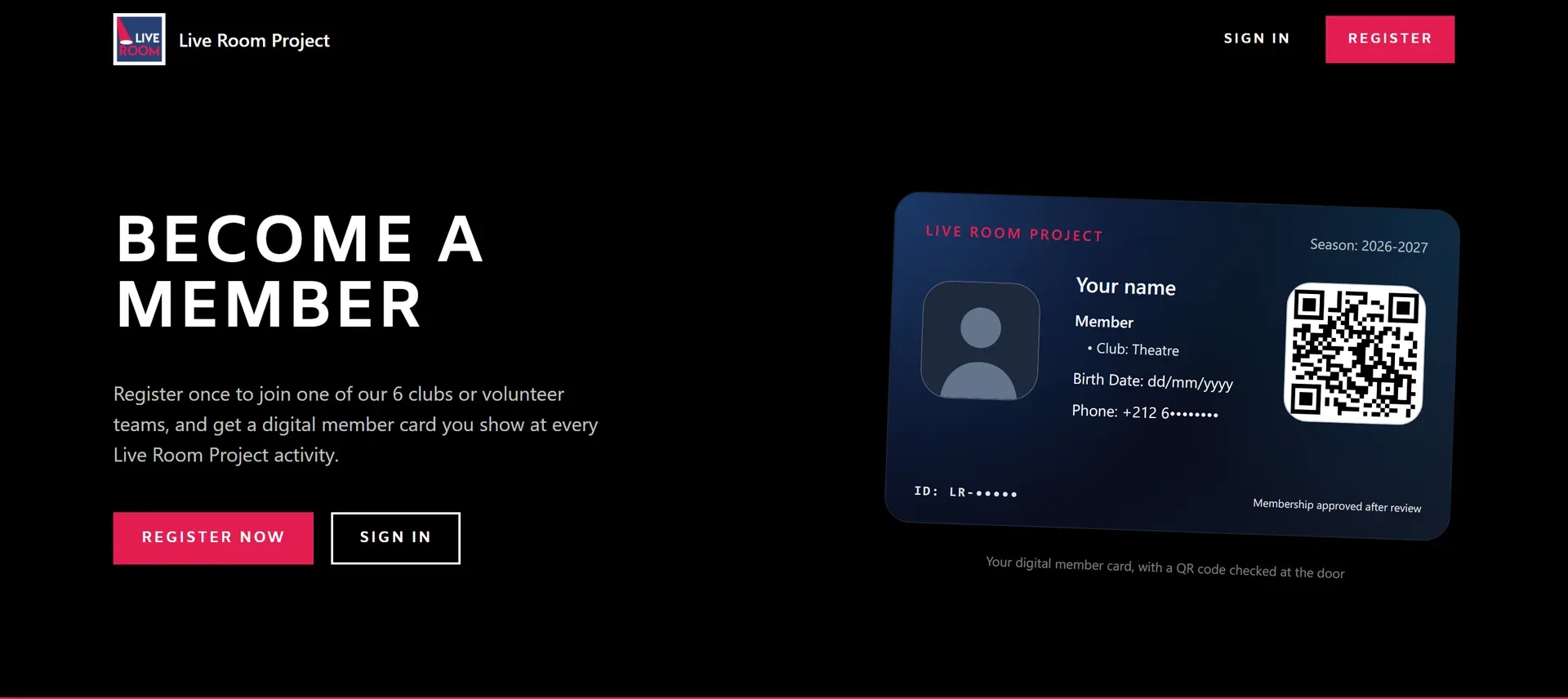
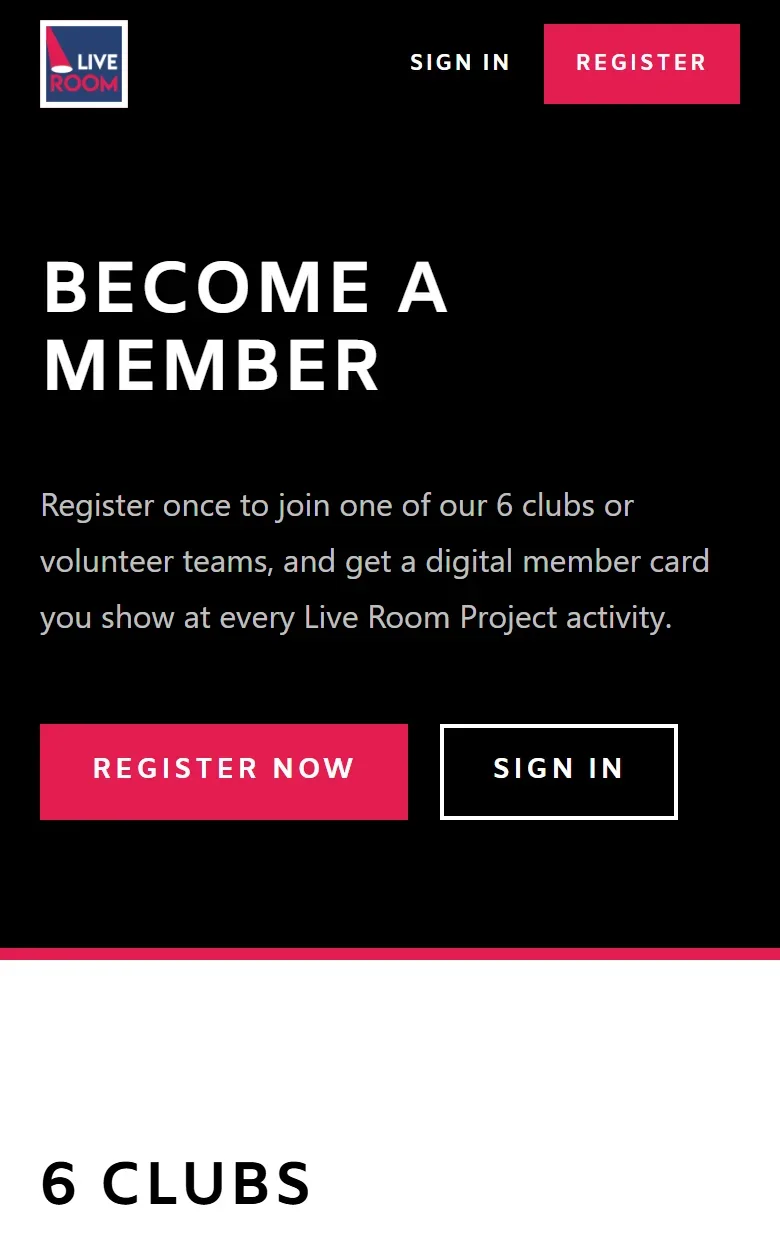
The homepage opens on the member card itself, next to one line on what membership gives you and a button to register.
WhyVisitors see what they get before they fill anything in.
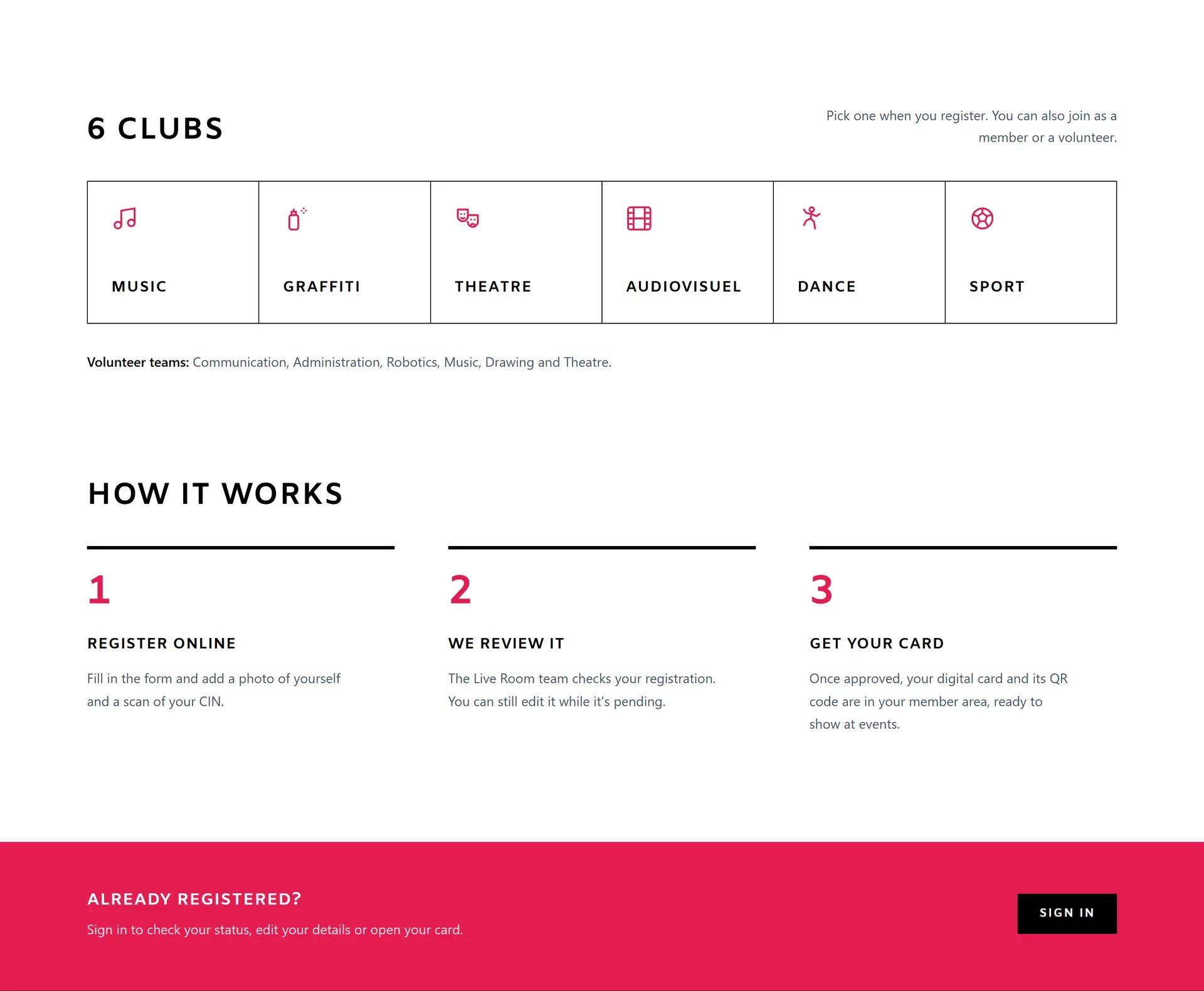
The clubs sit in one row of icons, followed by how it works: register, we review it, get your card.
WhyVisitors know what to pick and what happens after they press submit.
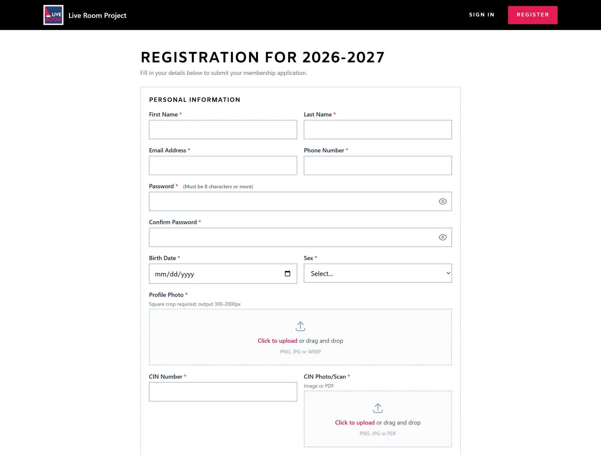
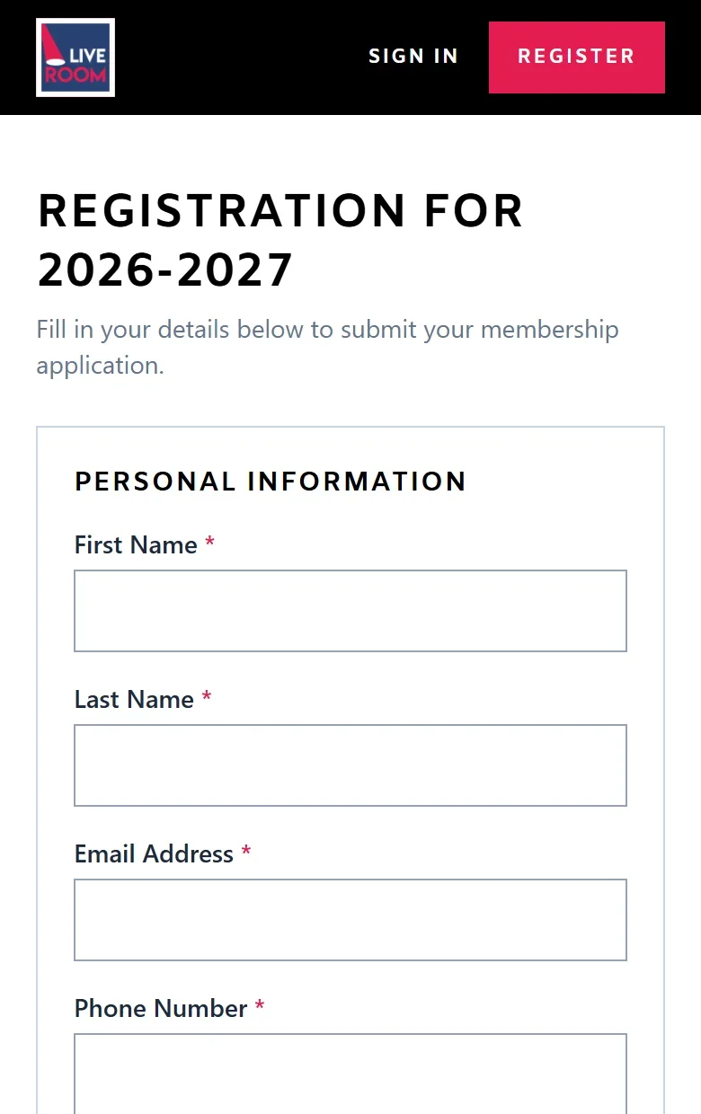
Personal information, membership type and medical information each get their own block. The photo is cropped square on upload.
WhyA long form feels shorter when you see it in parts.
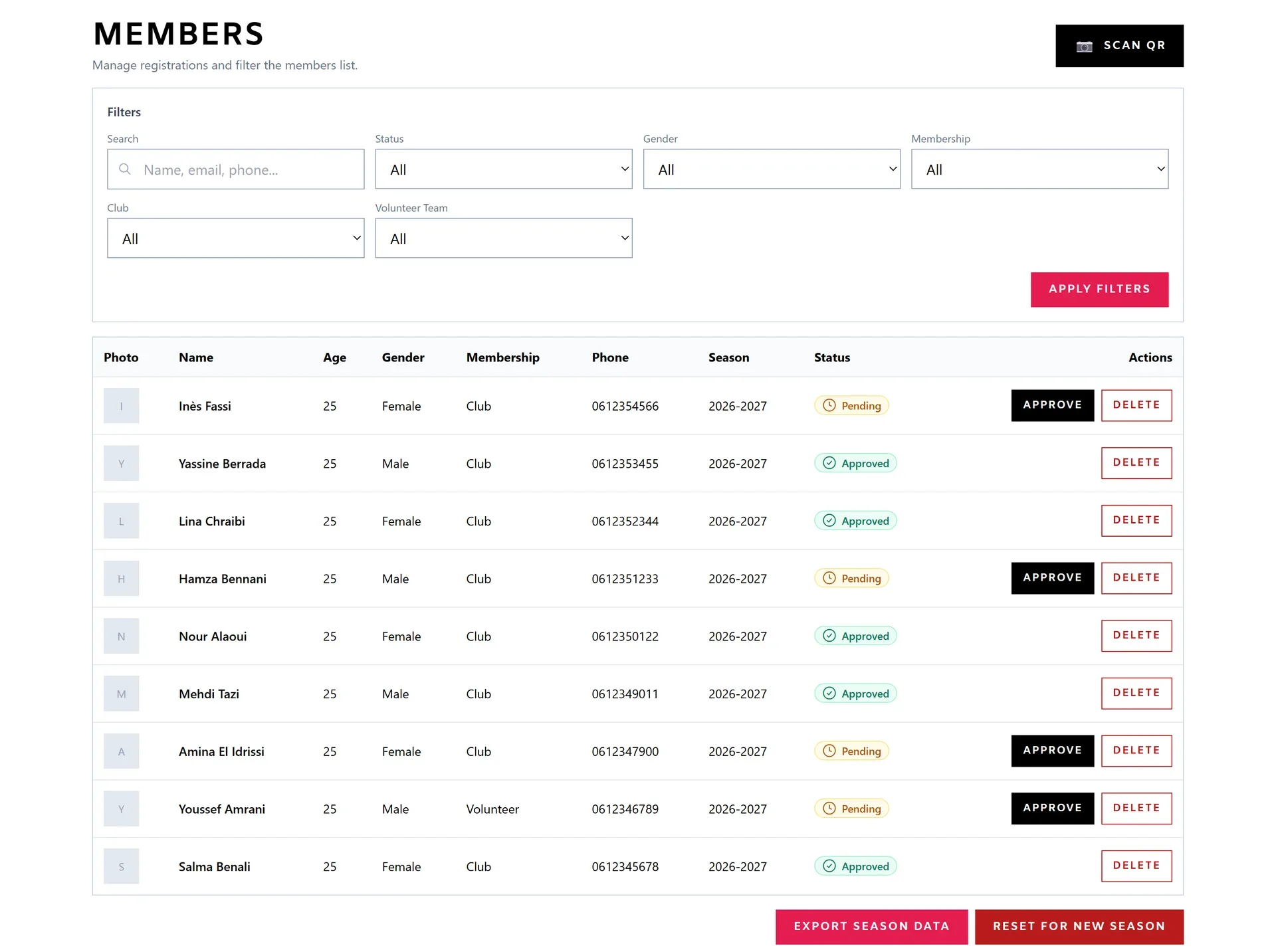
Every member in one table, with filters, a status and one button to approve.
WhyThe team can review a whole season of requests quickly.
Black, white and a single red that marks the main action on each screen: register, sign in, view the card.
WhyThe eye goes straight to the next step.
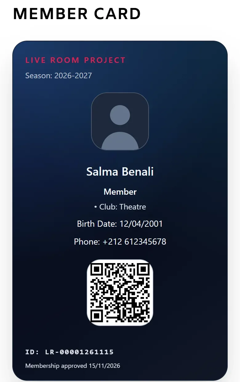
On a phone, the card turns vertical, with the photo, the details and the QR code stacked.
WhyMembers show it from their phone at the door.
THE SCREENS
THE RESULT
Registration moved from paper to the web. Visitors sign up online, the team approves them from one table, and members show their card from their phone.