
THE PROBLEM
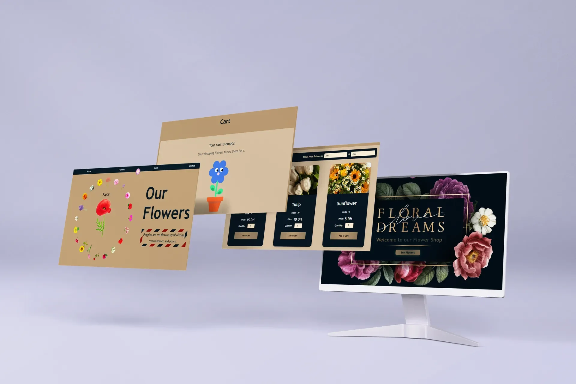
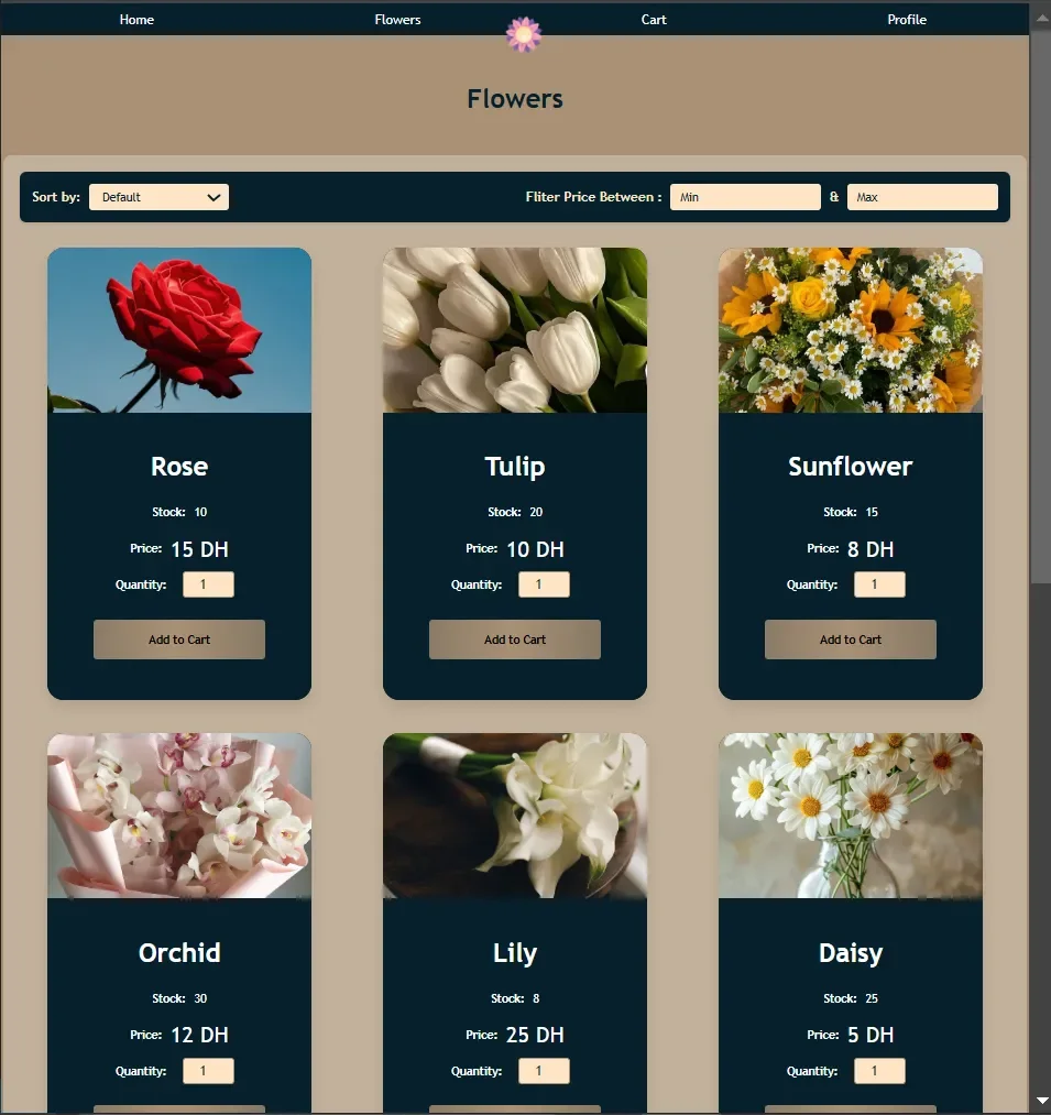
A flower shop has to feel like one and still work like an online store. Customers browse, choose and order, and the owner keeps an eye on what is left.
MY CHOICES
Four decisions shaped the design.
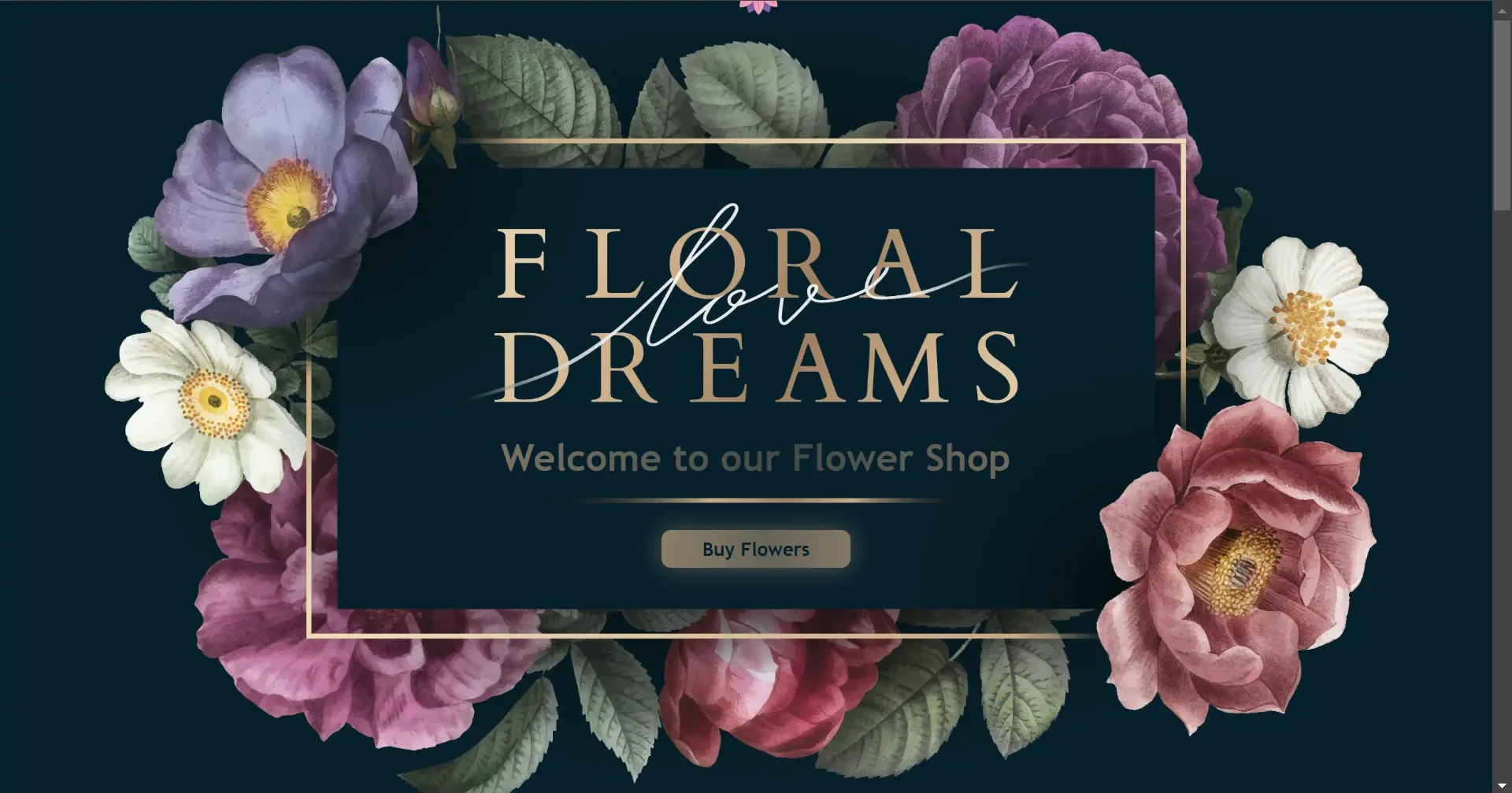
The welcome page sets the mood: deep green, painted flowers that bloom as the page loads, and one button to the shop.
WhyThe shop feels like a flower shop before anyone scrolls.
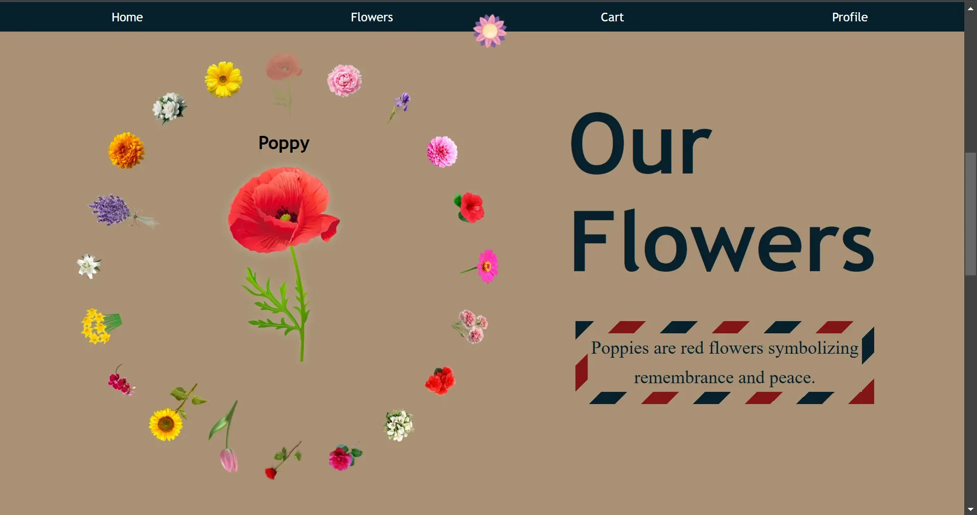
An animated carousel on the home page scrolls through the flowers and shows what each one means, like the poppy, a symbol of remembrance and peace.
WhyPeople choose flowers for what they mean, not only for how they look.
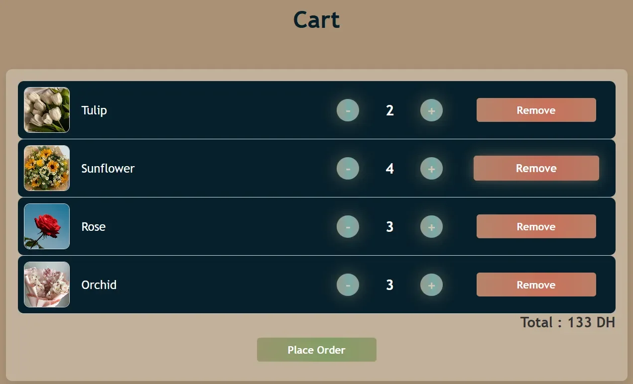
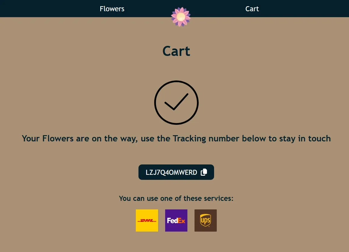
Items fade out when they leave the cart and when an order is placed.
WhyThe customer sees that the action worked.
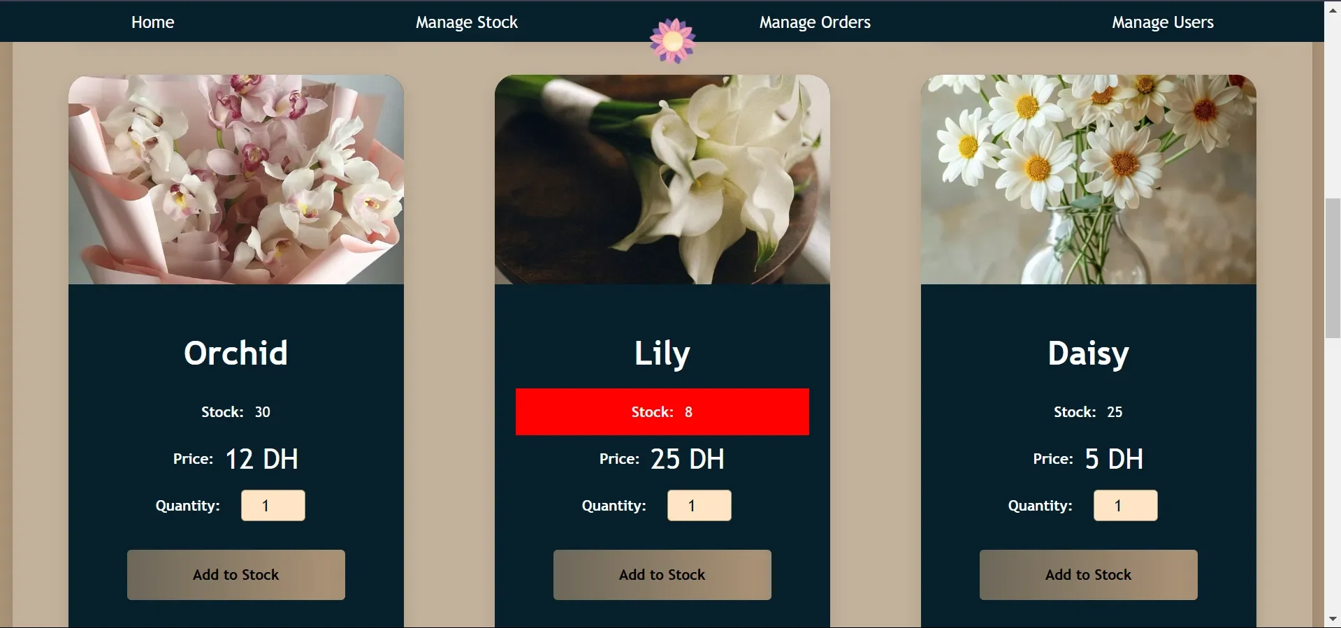
The admin view lists the stock for every flower and marks an empty one in red.
WhyThe owner sees what to restock without reading every number.
THE SCREENS
THE RESULT
A shop with one consistent look, from the welcome page to the order confirmation and the owner's tools.