
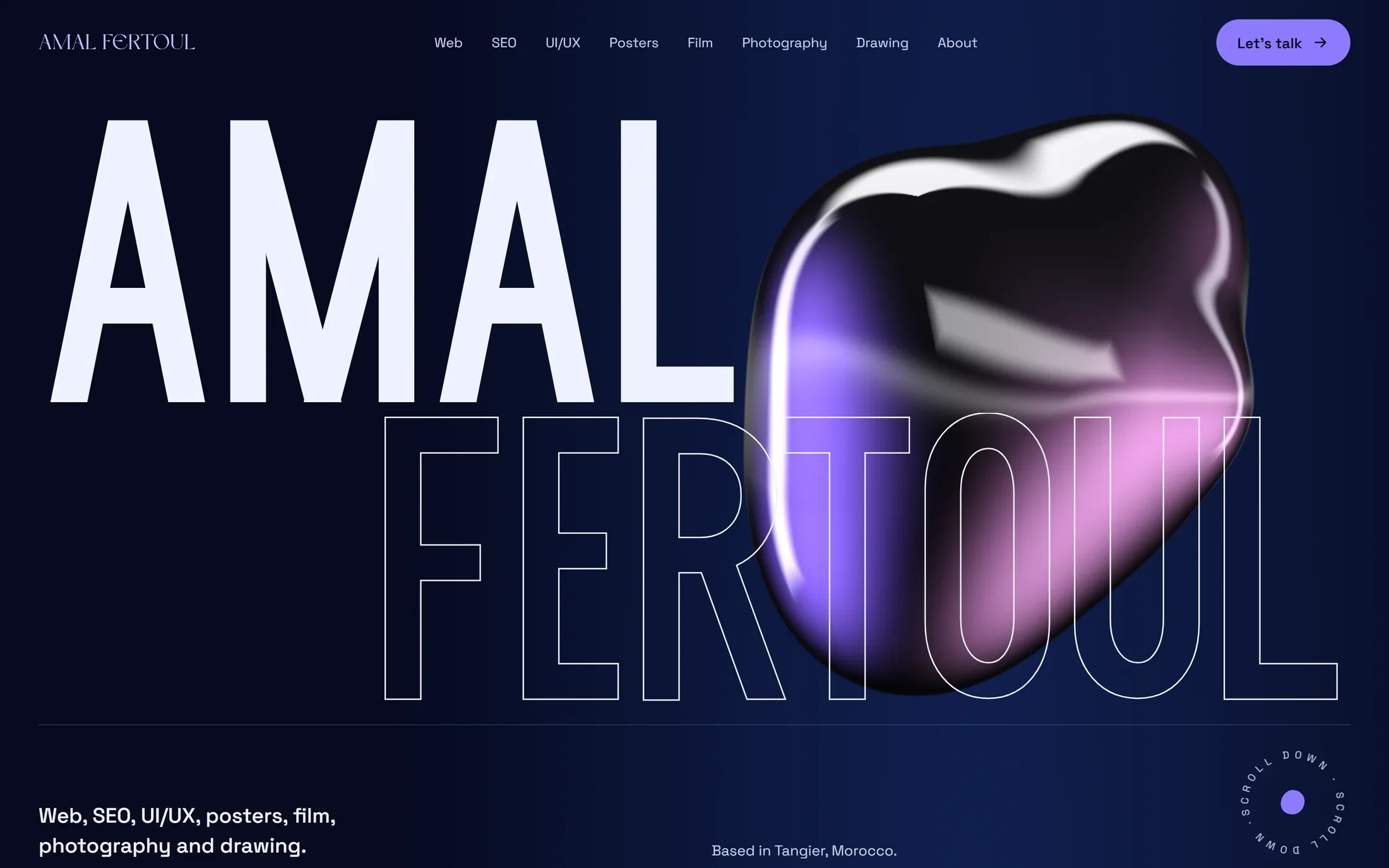
THE PROBLEM
My work lives in very different fields. I needed one site where someone looking for a developer and someone looking for an editor both find what they came for, and both feel it comes from the same person.
MY CHOICES
Five decisions shaped the design.
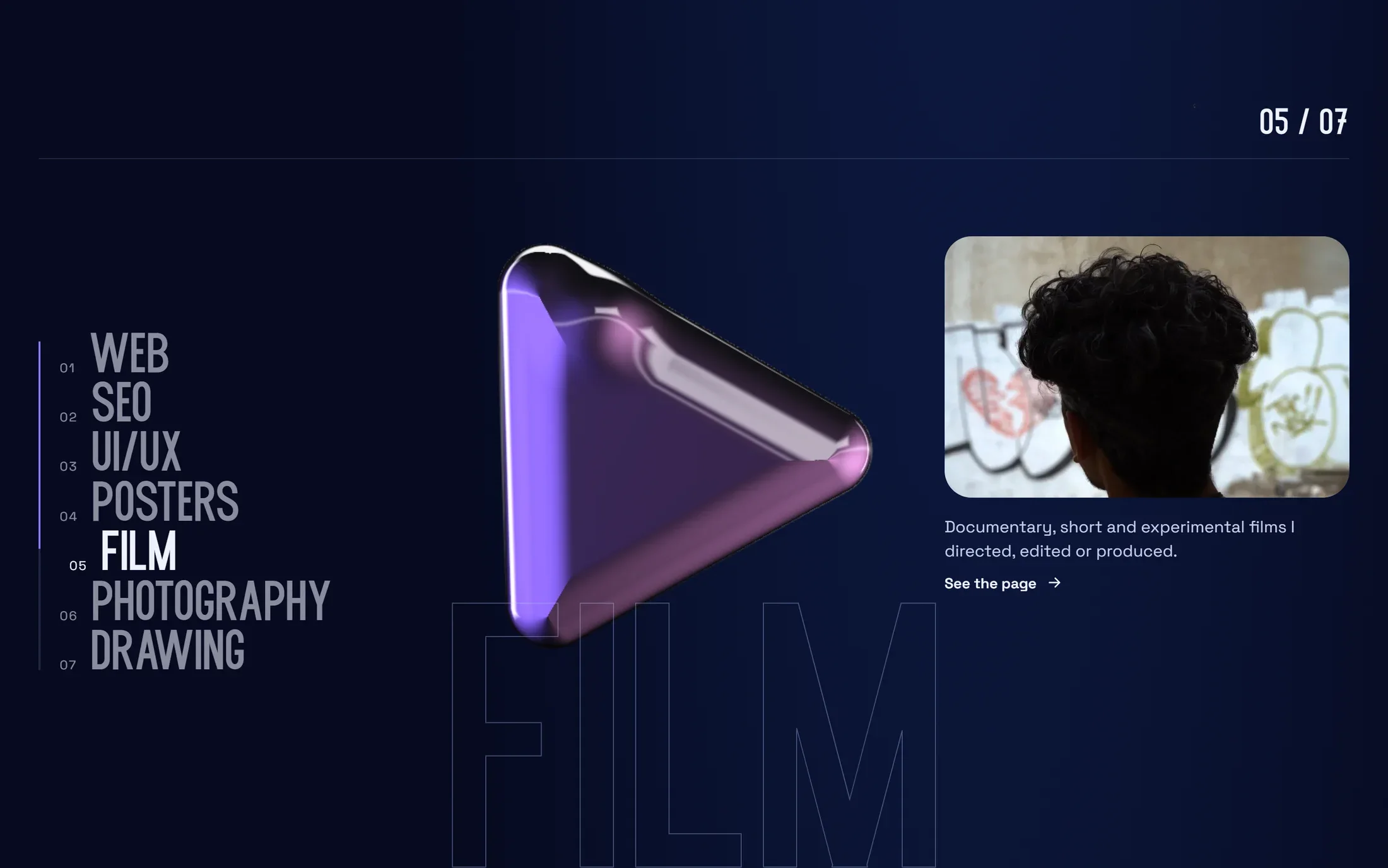
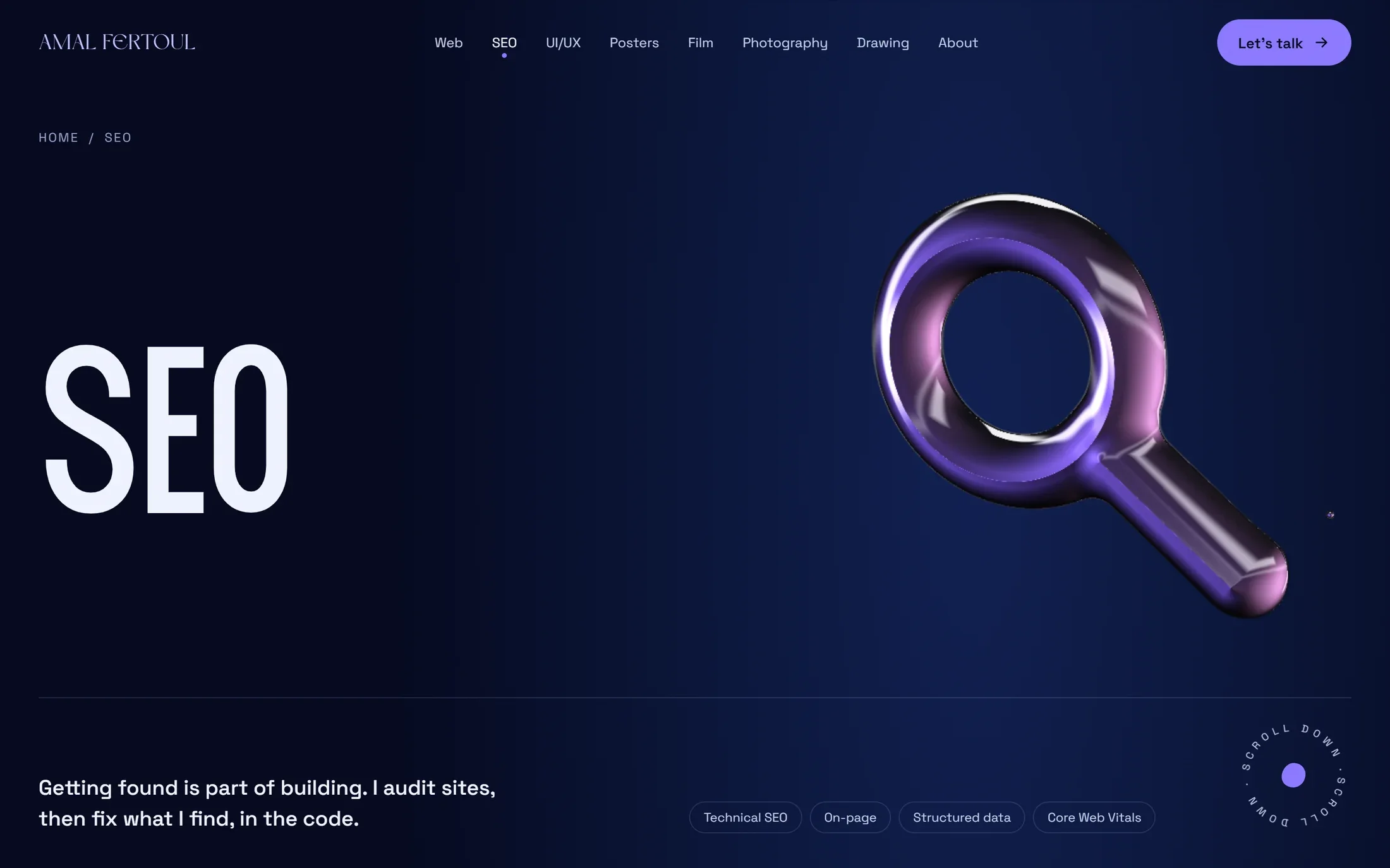
A 3D liquid sits behind every page and takes the shape of its field: code brackets, a magnifying glass, a pointer, a frame, a play button, a camera, a pencil.
WhyIt stands for flexibility: like a fluid, I adapt and change shape from one field to the next.
Web, SEO, UI/UX, posters, film, photography and drawing each have their own page.
WhyEach kind of work gets the space it needs, and visitors go straight to what interests them.
A navy base, with purple kept for actions and the current page, and mauve only for small highlights.
WhyWhen only one thing is purple, you know where to click.
Dream Avenue only for my name, Morinite for every title, Space Grotesk for everything else.
WhyThe name stays rare, and the titles carry the personality.
Pinned sections and the sideways work track behave the same on a phone.
WhyA portfolio link is often opened on a phone first.
THE SCREENS
THE RESULT
One identity across seven very different kinds of work, and a liquid that says the same thing on every page.